Branding
L/O: To explore the concept of branding and to create an effective brand image. 06/01/20
Company:
Name: Slimmy Jimmy.
What it does (purpose): Dietary company.
Unique Selling Point (USP): This slimming company is aimed mainly at men at the ages of 30-70.
Target Audience: 30-70 year old men.
Similar Slogan:"Snap into a slim jim!"


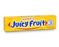
Name: Refresh
What it does (purpose): Chewing gum
Unique Selling Point (USP): This gum is aimed at 9 and above
Target Audience: 9 and above
Similar Slogan: "Eat, drink, chew Extra!"


I came up with this design because of the business being a weight loss company so i put a silhouette of a strong person. Also, it has the name of the company, the copyright R and the year the brand was found.
I came up with this design because I thought the palm tree looked cool and I've added the name of the brand and warped the name, put in the copyright R and the date the company was found.
I came up with this quick and short design because it was easy and the SJ stands for Slim Jim and I've added the copyright R in the bottom because its a brand and others can't use this because of that.
13/01/20

Company:
Name: Slimmy Jimmy.
What it does (purpose): Dietary company.
Unique Selling Point (USP): This slimming company is aimed mainly at men at the ages of 30-70.
Target Audience: 30-70 year old men.
Similar Slogan:"Snap into a slim jim!"


Name: Refresh
What it does (purpose): Chewing gum
Unique Selling Point (USP): This gum is aimed at 9 and above
Target Audience: 9 and above
Similar Slogan: "Eat, drink, chew Extra!"


I came up with this design because of the business being a weight loss company so i put a silhouette of a strong person. Also, it has the name of the company, the copyright R and the year the brand was found.
I came up with this design because I thought the palm tree looked cool and I've added the name of the brand and warped the name, put in the copyright R and the date the company was found.
I came up with this quick and short design because it was easy and the SJ stands for Slim Jim and I've added the copyright R in the bottom because its a brand and others can't use this because of that.
13/01/20
What is brand identity?
L/O: To explore the idea of brand identity and apply it to our logo design.
1. Lego
2. Apple
3. Gillette
4. Rolex
5. British Airways
6. Coca-Cola
7. Andrex
8. Mastercard
9. Visa
10. Dyson
Apple
Popular
Well-known
Expensive
Smart technology
In the top 10 companies in the UK 2019
Desirable
Influential
Global
Good quality
Disney
Popular
Well-known
Rich
Childish
Good family films
Child-friendly
Creative
Fun
Innovative
Coca-Cola
Popular
Well-known
Rich
Good drink
Fizzy
Refreshing
Scrumptious
Tasty
Accesible
Apple have showed their new brand values by putting the phone in certain situations such as spilling a drink on the phone showing that its waterproof to a certain depth. Also, they showed how good the camera quality is by taking selfies, pictures in a shop and photos/videos of a grasshopper and it shows how much you can zoom in for. Another situation they put the phone in is them saying the phone can go as deep as 2 metres underwater for up to 30 minutes. Furthermore, they show that you can now take slofies (slow motion selfies) with the double camera which resembles two eyes which makes things easier to see and have a better photo. Finally, Apple have added the best chip to ever be in any phone and it makes the phone faster and can play games that require high FPS.
My brand values:
Cheap
Popular
5-stars
Open 7 days a week
Reliable
Slim Jim is welcoming to all ages and is 5 stars and is open 7 days a week.
20/01/20
23/01/20


These are my new brand logos (Slim Jim) and they are in my opinion are the better, upgraded versions of the previous logos which had nothing to do with the actual brand. Also, they were very lazy and very sloppily put together but one of them had a nice and unique design but didn't work with this type of brand. Furthermore, these logos took more time and I took more care with these logos and they look so much better and I am more proud of them. I also used details such as the R for the copyright claim and used the 'Found in 2020' so it shows people that it was only found this year and it is new and ready for anyone to join as little as £5/month. The things i could of added is the details to the Slim Jim website to find all the details about joining the fitness programme. In the blue logo, I really like the way I warped the Slim Jim bit and that I made it bend round the inside of the circle and I also really like the fonts i used for both of the logos. Finally, I could have also added a different background maybe a pair splatter or a matte look or a platinum, shiny look which may have been better because these logos are better than the others but it could have been a lot better.
20/01/20
Brand Identity
L/O: To identify conventions of logo design and apply them to our logo design
My brand (Slim Jim) is a very reliable company that invites men from the ages from 30-70 to come and loose weight for a cheap, reasonable price.
Logo Design
23/01/20
Logo Design


These are my new brand logos (Slim Jim) and they are in my opinion are the better, upgraded versions of the previous logos which had nothing to do with the actual brand. Also, they were very lazy and very sloppily put together but one of them had a nice and unique design but didn't work with this type of brand. Furthermore, these logos took more time and I took more care with these logos and they look so much better and I am more proud of them. I also used details such as the R for the copyright claim and used the 'Found in 2020' so it shows people that it was only found this year and it is new and ready for anyone to join as little as £5/month. The things i could of added is the details to the Slim Jim website to find all the details about joining the fitness programme. In the blue logo, I really like the way I warped the Slim Jim bit and that I made it bend round the inside of the circle and I also really like the fonts i used for both of the logos. Finally, I could have also added a different background maybe a pair splatter or a matte look or a platinum, shiny look which may have been better because these logos are better than the others but it could have been a lot better.


Josh - none of these logos have anything in common with each other. Think about what you are trying to say about your brand through your logo. Why a palm tree? Why yellow and red??
ReplyDelete